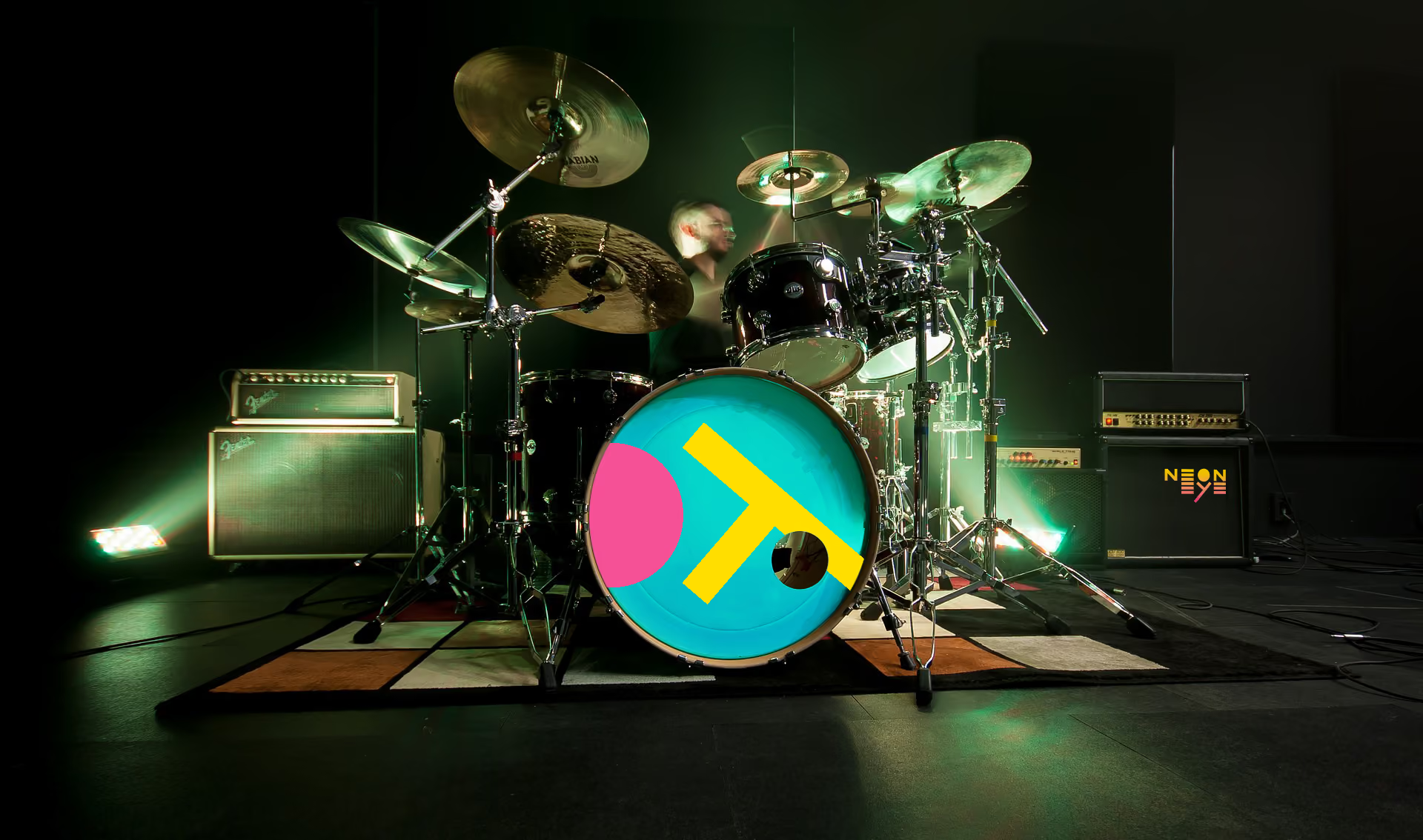
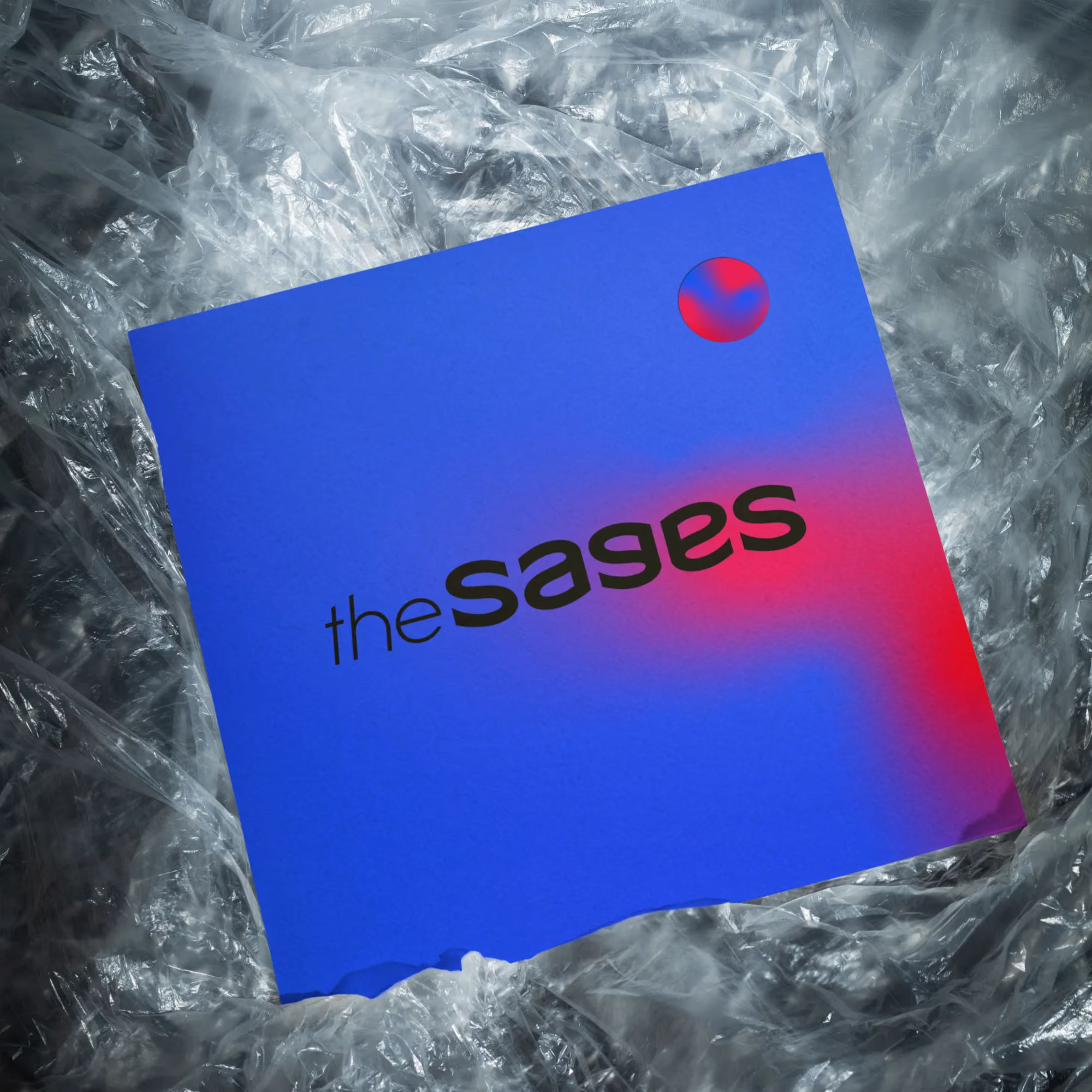

Nut’day is a conceptual brand created for a premium nuts and dried fruit retailer. Although it wasn’t developed for a real client, the project follows the same process I use for commercial work. Starting with research and strategy, I developed the brand positioning, customer personas, visual identity, packaging system and a complete e-commerce experience. The goal was to create a healthy food brand that feels modern, energetic and memorable instead of following the familiar organic aesthetic found across the category.
The project began with defining the business goals, target audience, positioning and communication principles. Research identified three primary customer groups: office workers looking for healthier everyday snacks, students searching for quick energy on the go, and tourists interested in premium local gifts. These audiences shaped both the brand strategy and the overall customer experience. One thing became obvious during the research. Most healthy snack brands look almost identical. They rely on earthy colours, handwritten typography and nature-inspired visuals. Nut’day deliberately moves in the opposite direction. Instead of trying to look organic, the brand feels urban, bold and contemporary. The chosen direction combines an energetic personality with a premium finish, making healthy snacks feel less like a compromise and more like something people genuinely want to buy. That strategic decision became the foundation for every design choice that followed.
Visual Identity and Packaging
.avif)

.avif)
%20copy.avif)
.avif)
.avif)
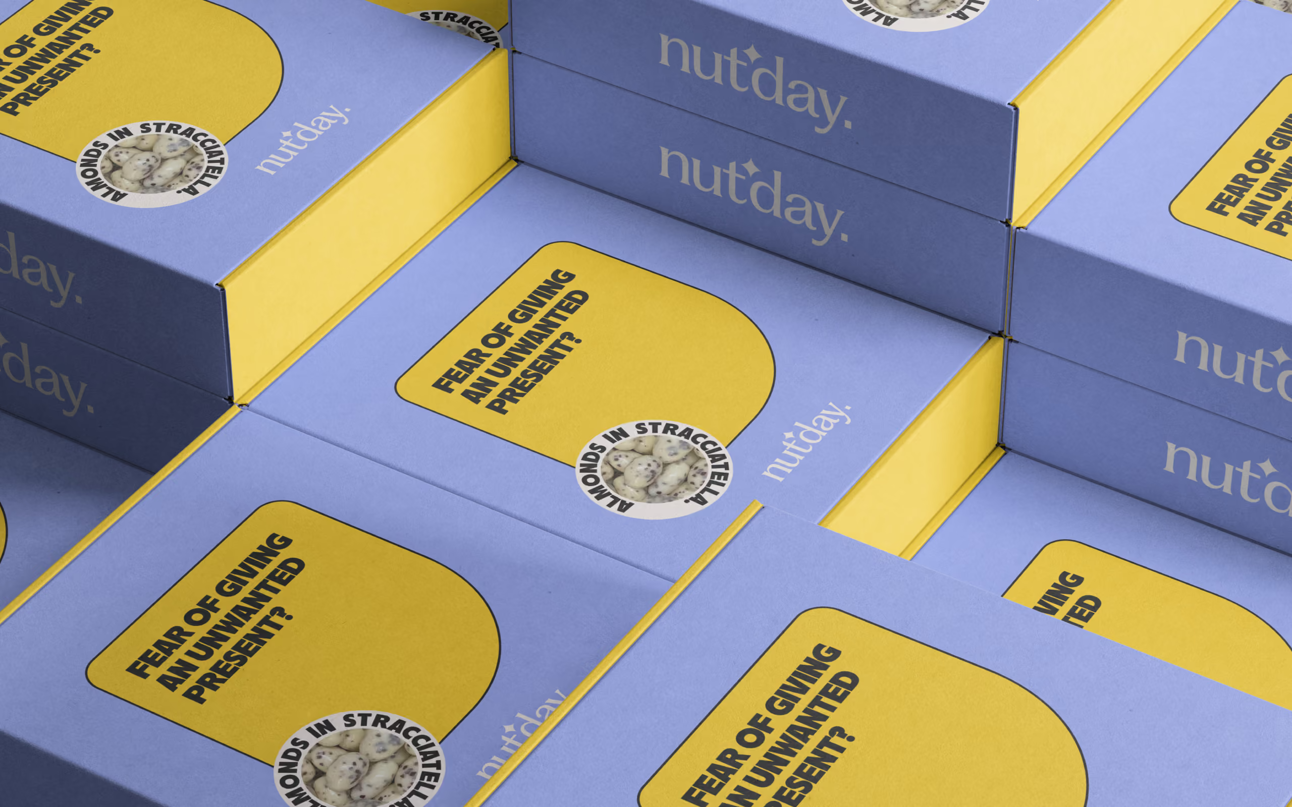
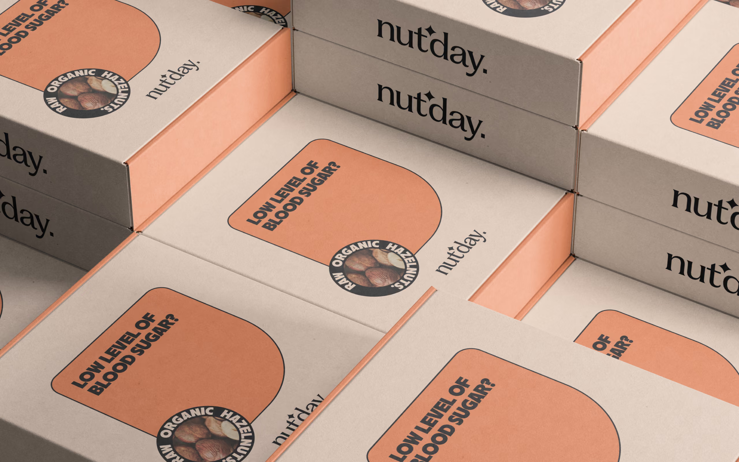
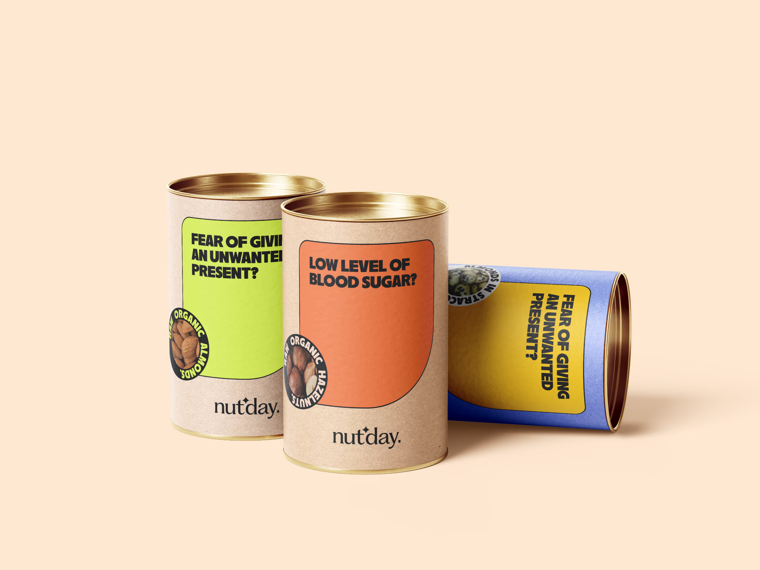
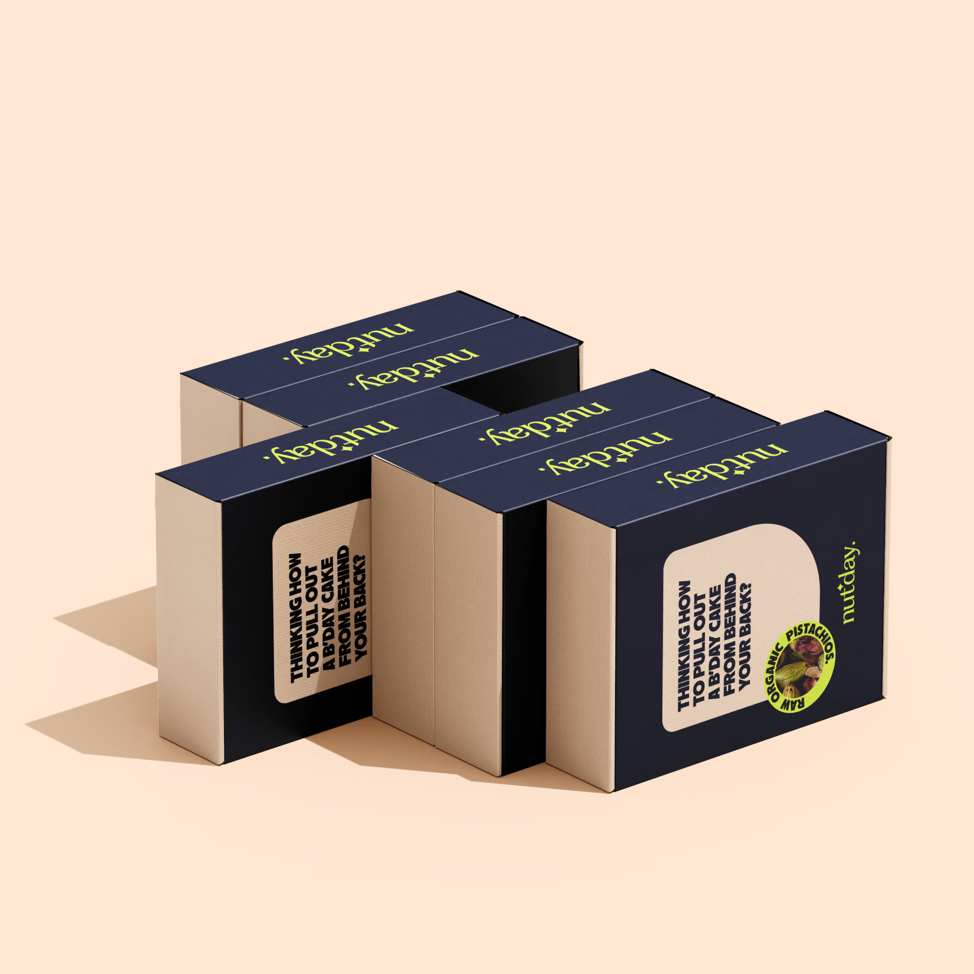
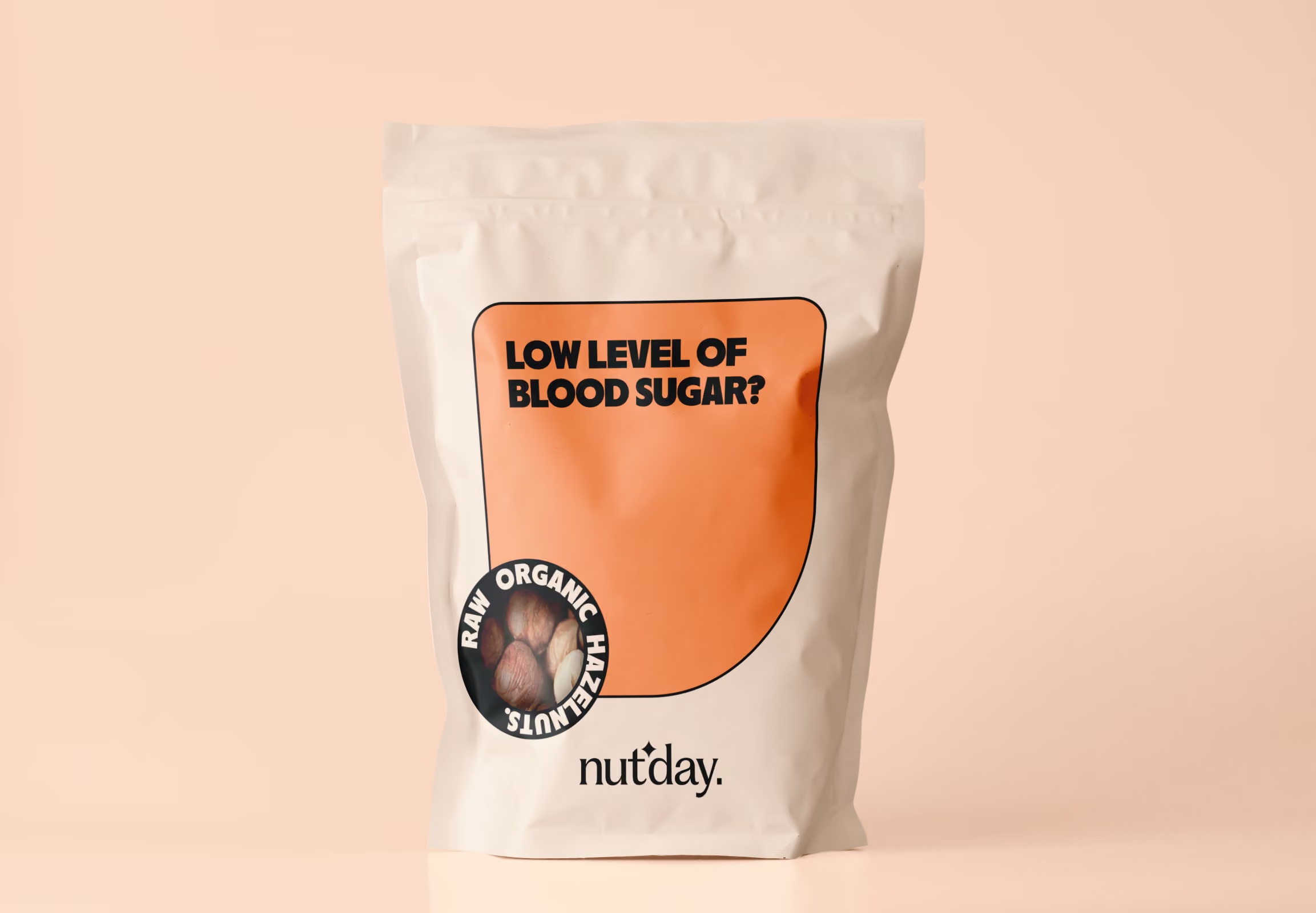
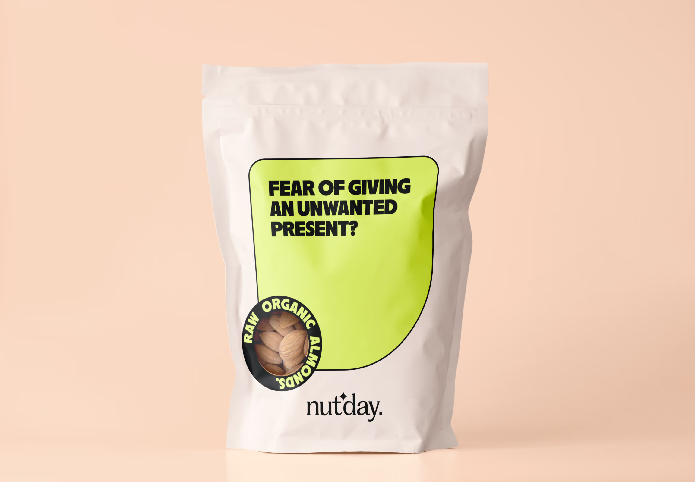
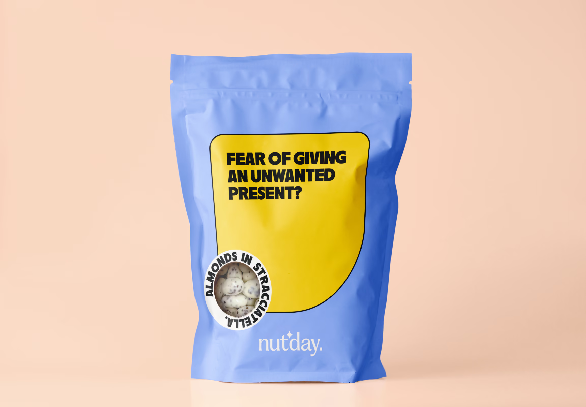
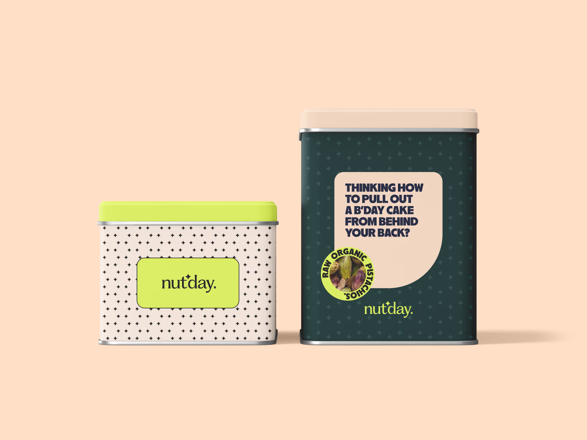
Large typography and vibrant colour combinations help the products stand out on the shelf without relying on traditional health food cues. Instead of filling the packaging with product photography, every pack features a bold headline designed to grab attention, while a circular window reveals the actual product inside. The packaging does the talking first, then lets the product prove the point. The colour palette changes across product categories, but the visual system stays consistent, making it easy to expand the range while keeping the brand instantly recognizable.
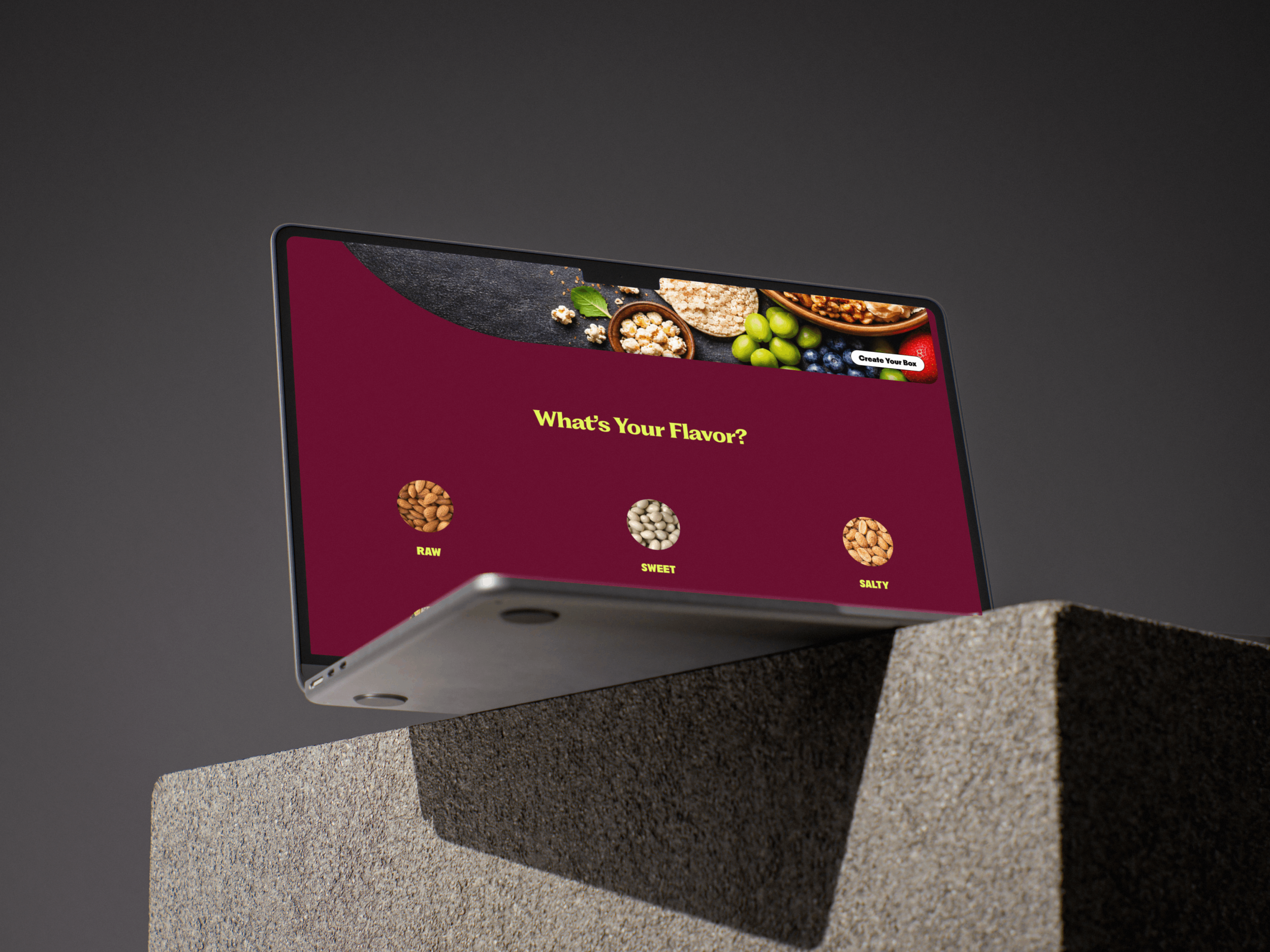
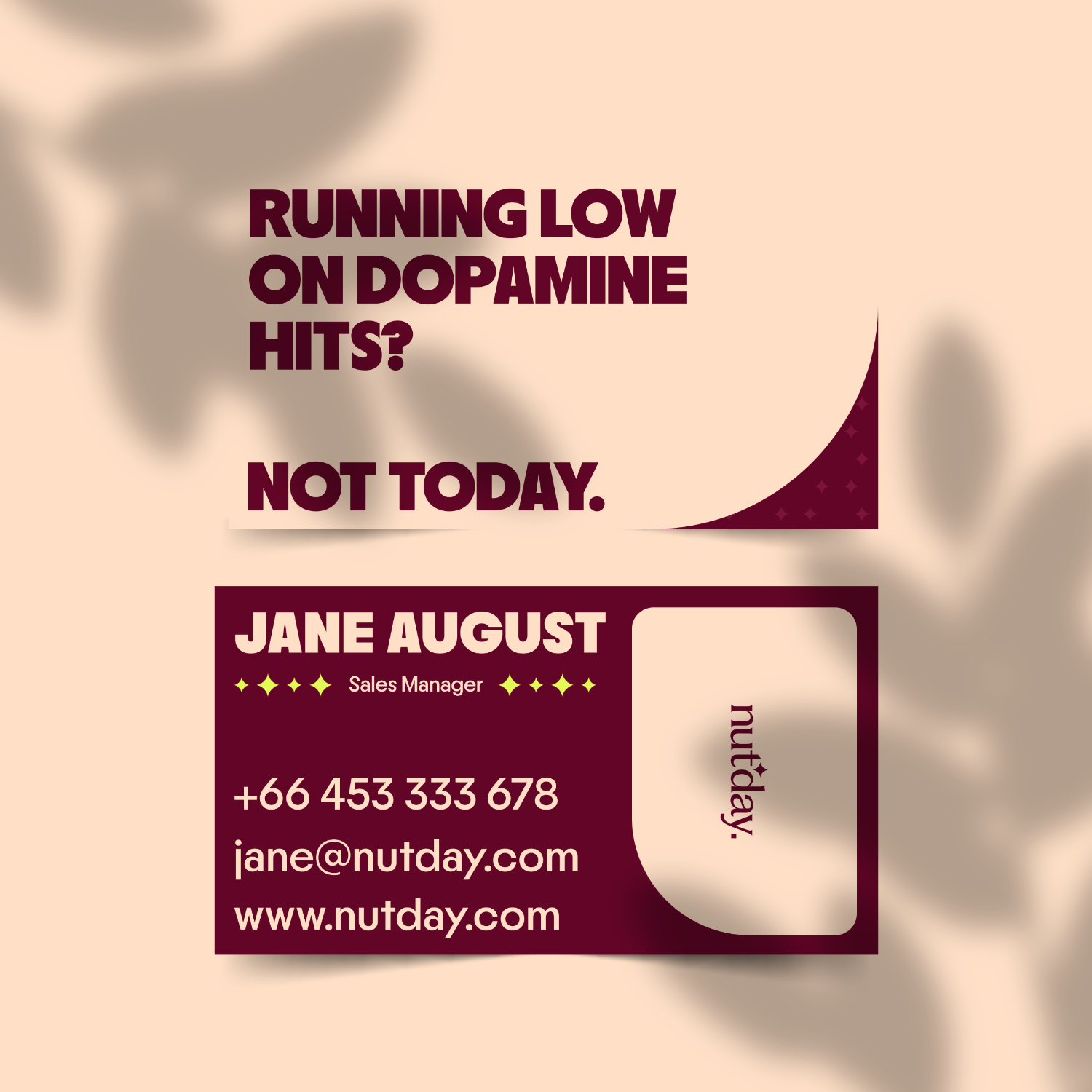
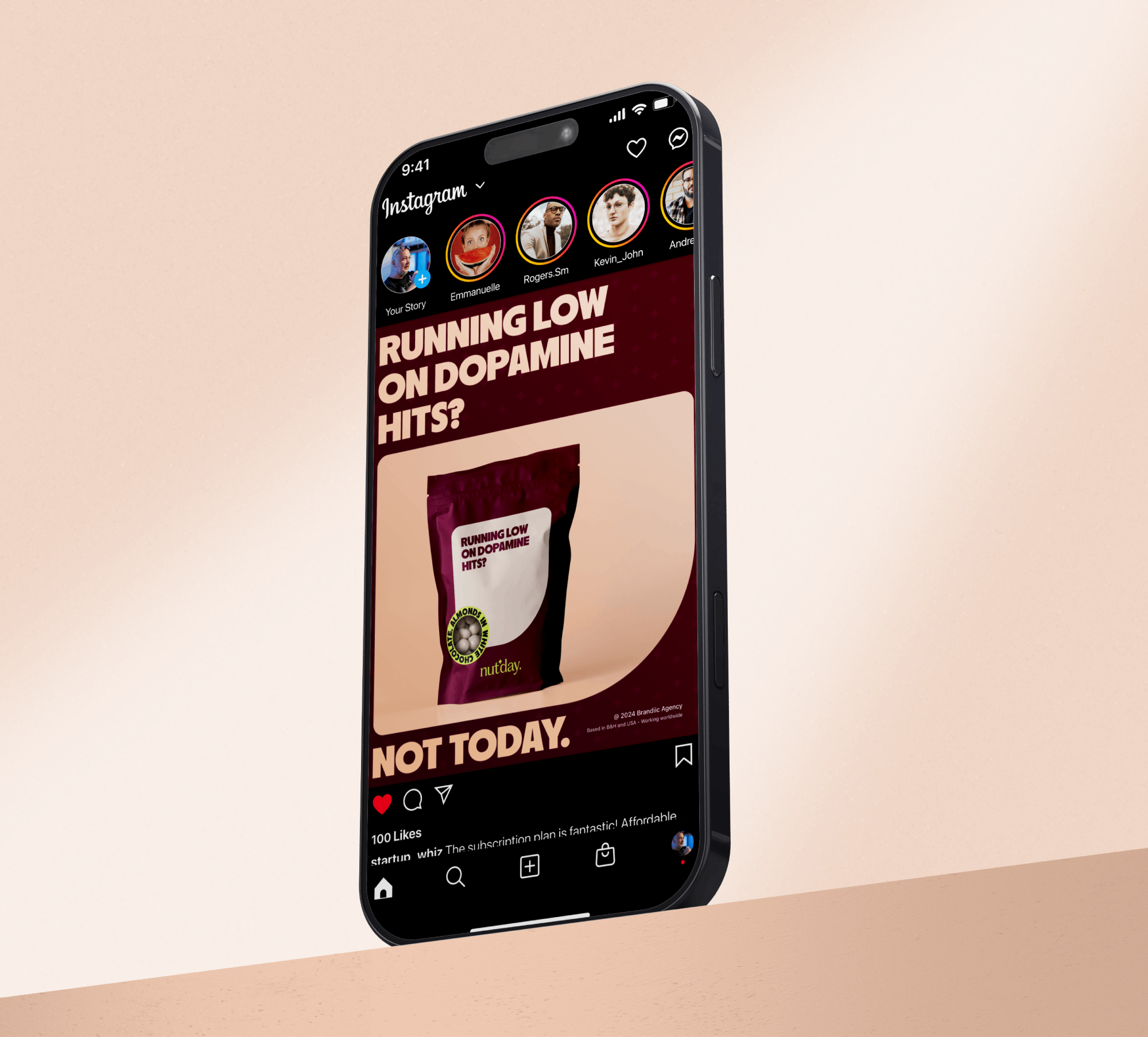
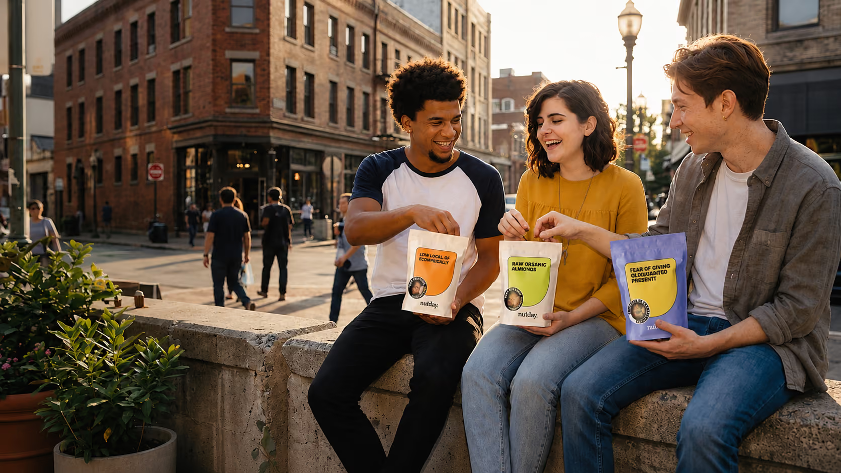
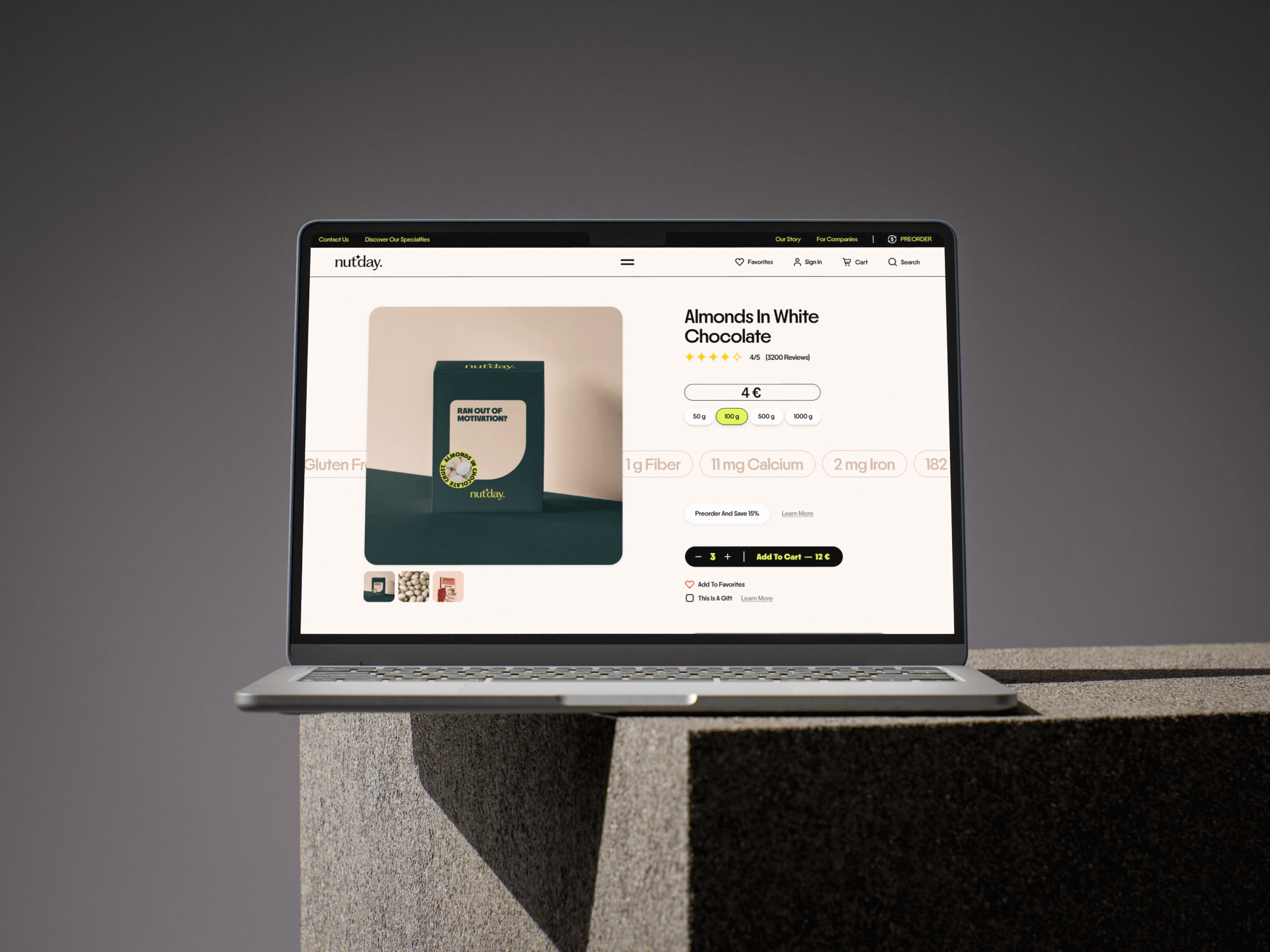
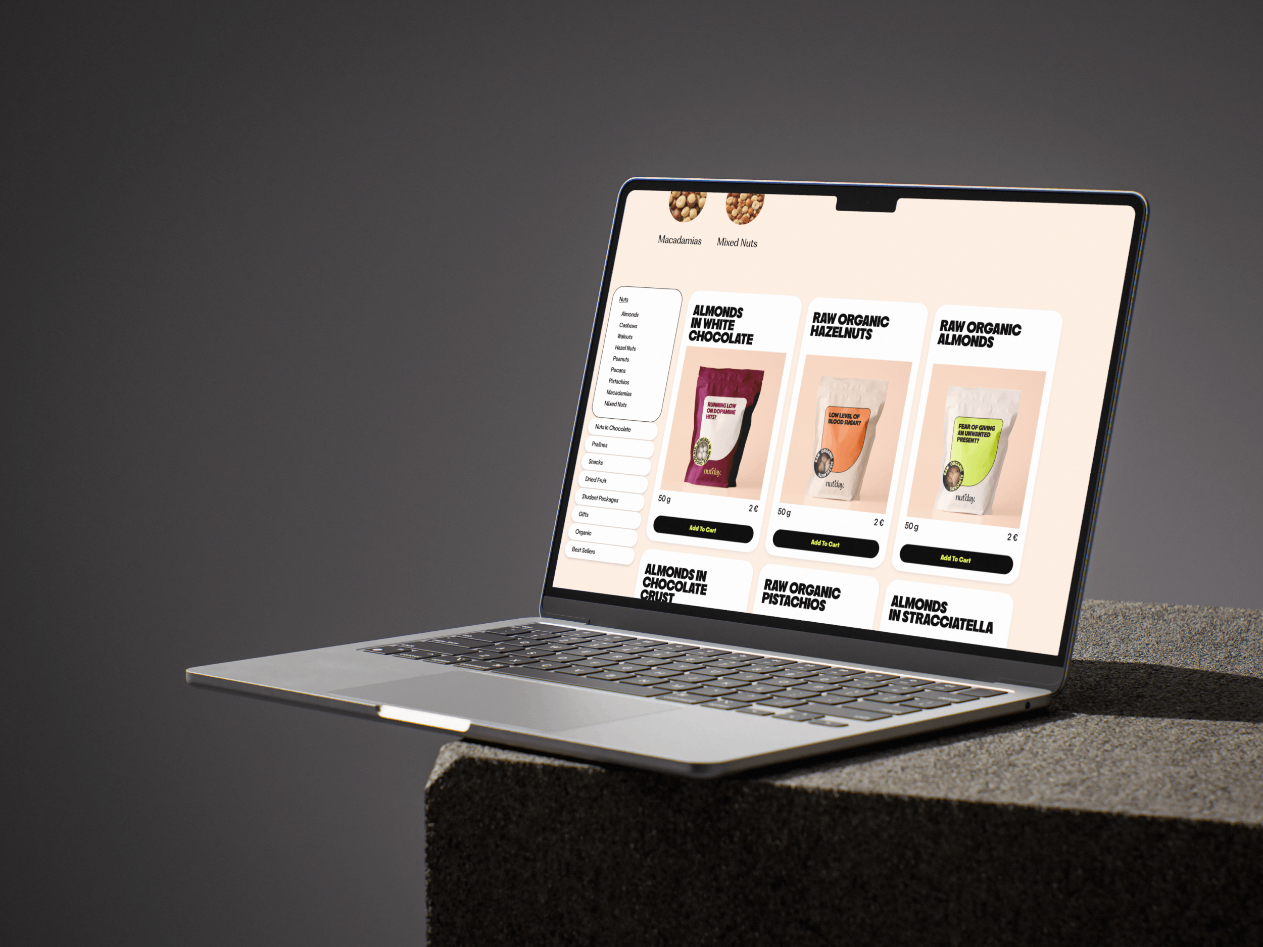
The identity was applied across flexible packaging, cardboard boxes, premium gift packaging, in-store materials, social media campaigns and a fully designed e-commerce website. Every touchpoint follows the same visual language, creating a consistent experience whether someone discovers the brand online, walks into the store or receives it as a gift. Together, the strategy, identity and applications create a brand that feels confident, playful and premium while giving Nut’day a clear position in a market where many competitors still look and communicate the same way.
Web Design


Home Page Preview