

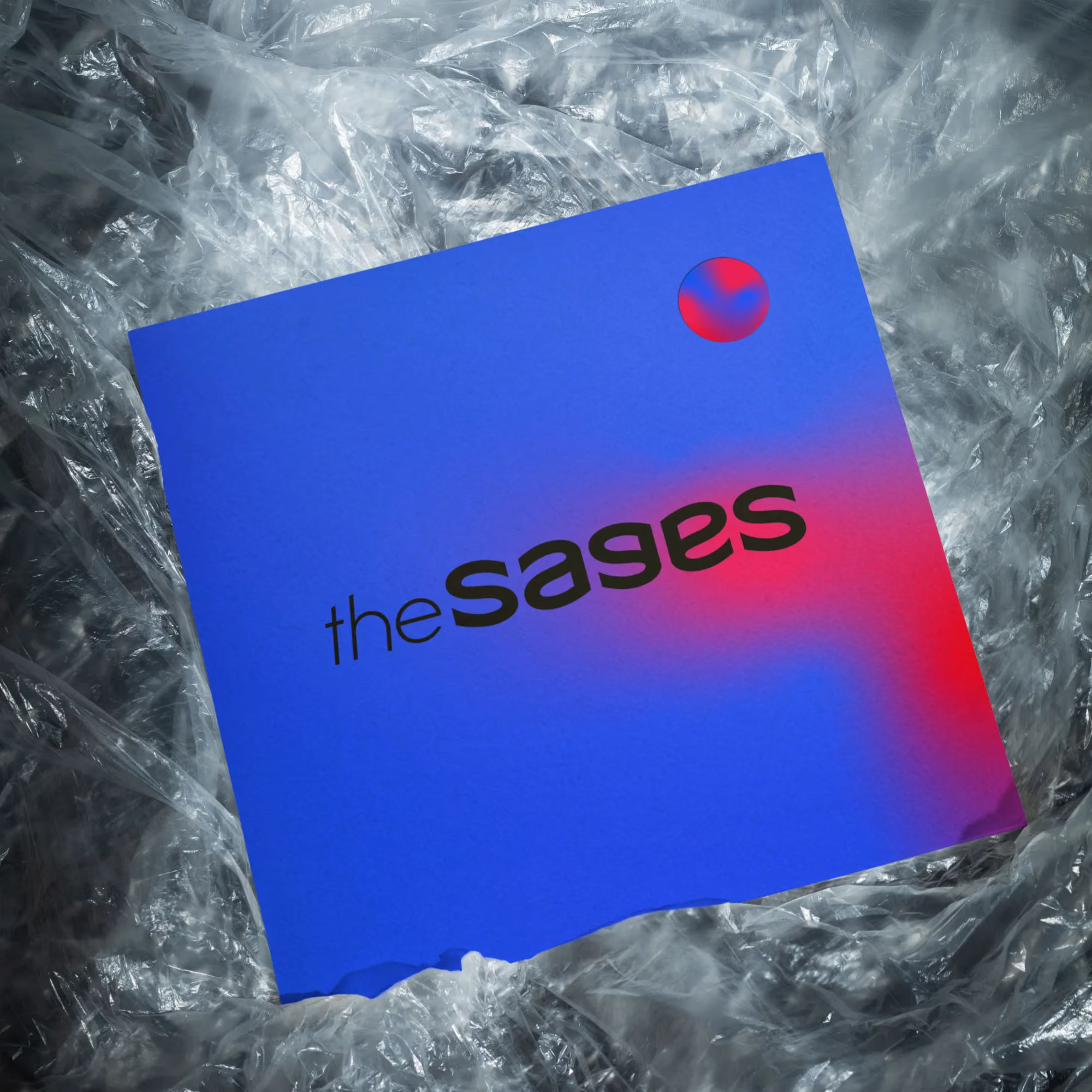

Neon Eye is an alternative pop-rock band looking for a bold identity that feels different from what you’d normally expect in the genre. The project included a complete visual identity together with a set of print and digital applications.
A lot of alternative bands naturally drift towards dark visuals, distressed typography and the usual rock clichés. I wanted to go in the opposite direction. Neon lights, clean geometry and strong color contrast felt like a much better fit for the band’s personality.
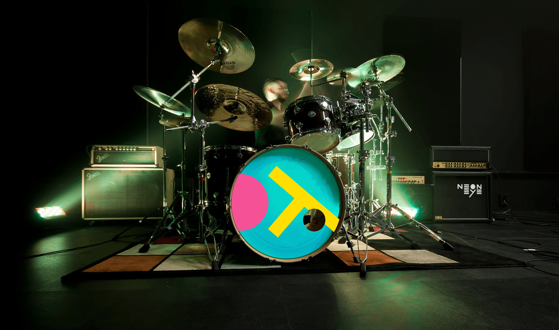
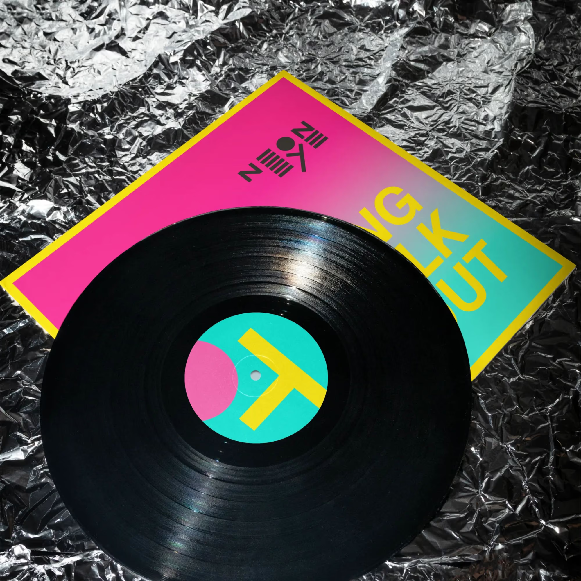
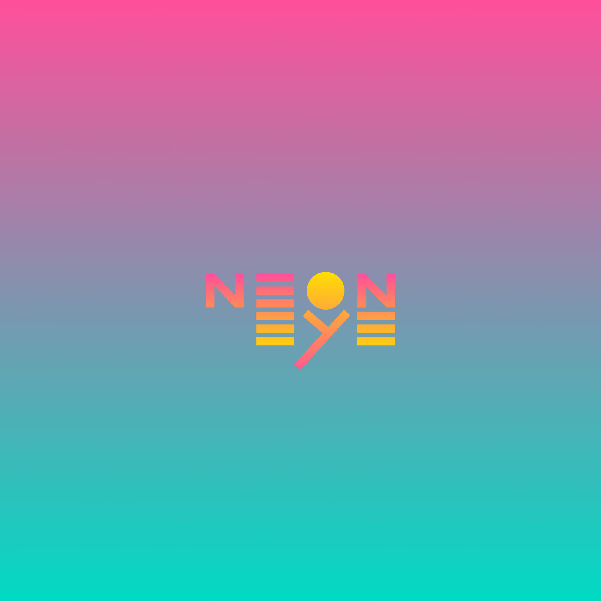

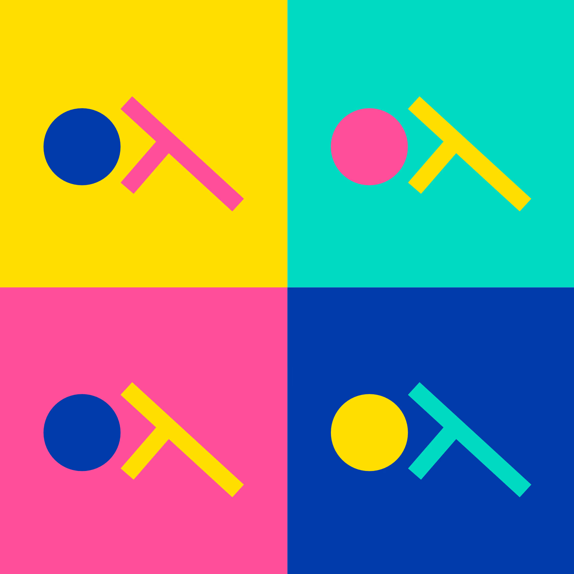
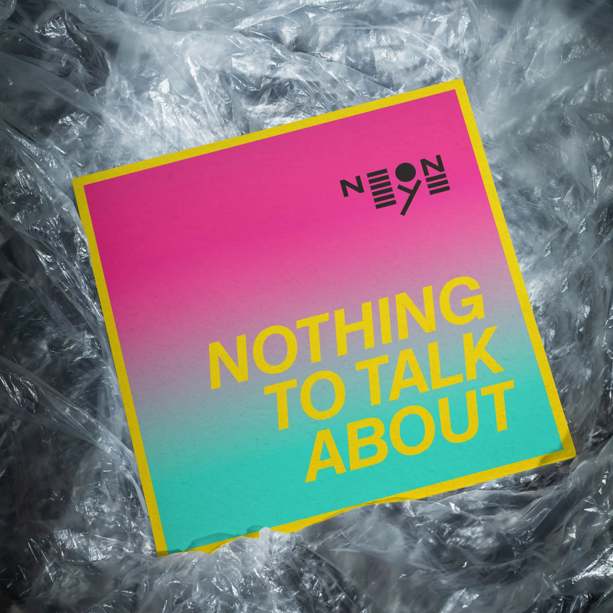
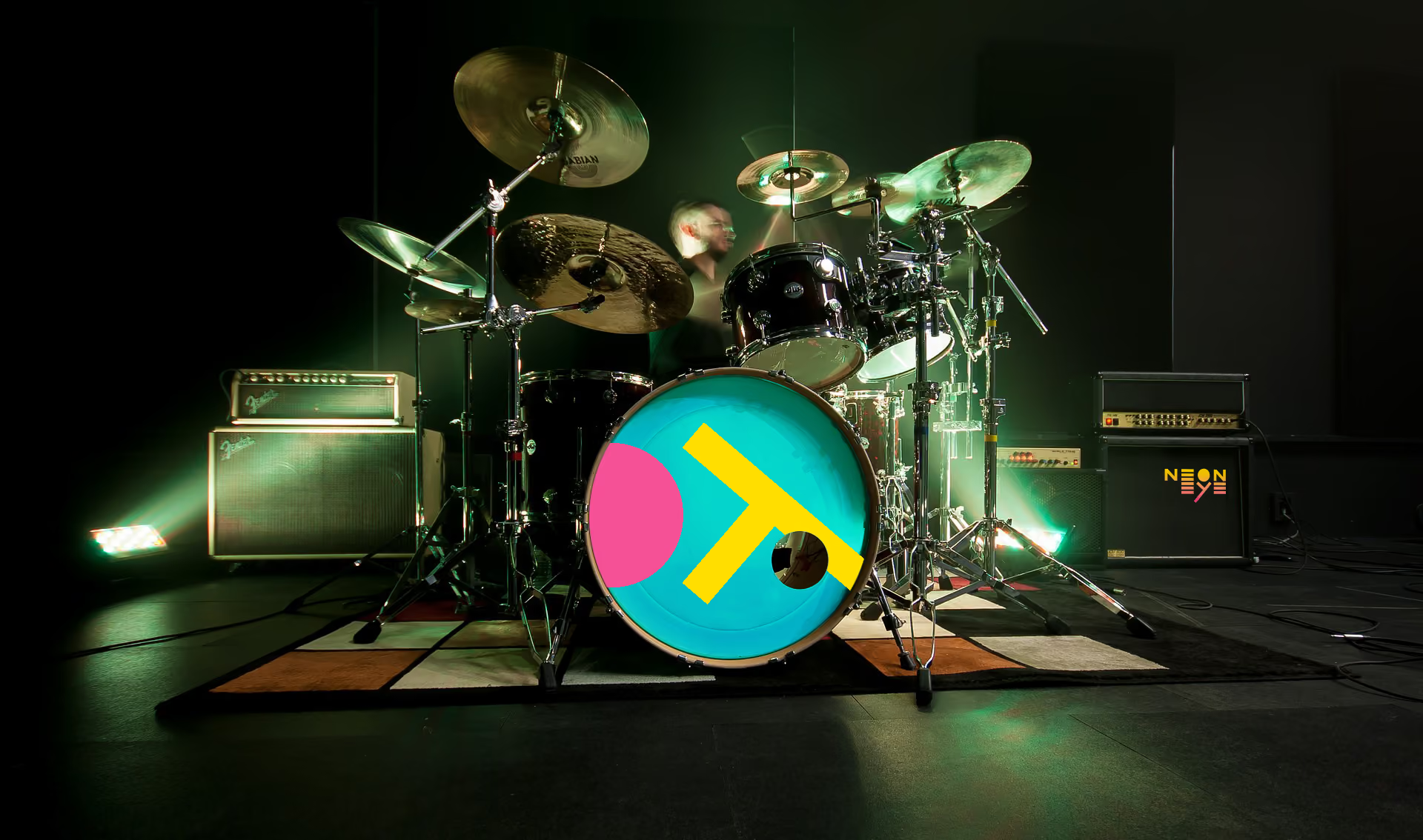
The logotype takes inspiration from the clean geometry of neon light tubes, creating a bold and minimal form with a distinctive rhythm. The symbol, derived from an abstract eye, combines an iris and tear duct into a simple, iconic mark that works independently or alongside the logotype. The palette borrows colors from city lights after dark. Bright pink, cyan, yellow and deep blue give the identity enough energy without relying on typical rock aesthetics.
The color palette draws inspiration from glowing neon lights found throughout the city at night. Vibrant pink, cyan, yellow, and deep blue create an energetic visual atmosphere that reflects the band’s expressive sound. Combined with bold typography and simple geometric compositions, the identity delivers a striking presence that feels contemporary, playful, and unmistakably unique.


.avif)