

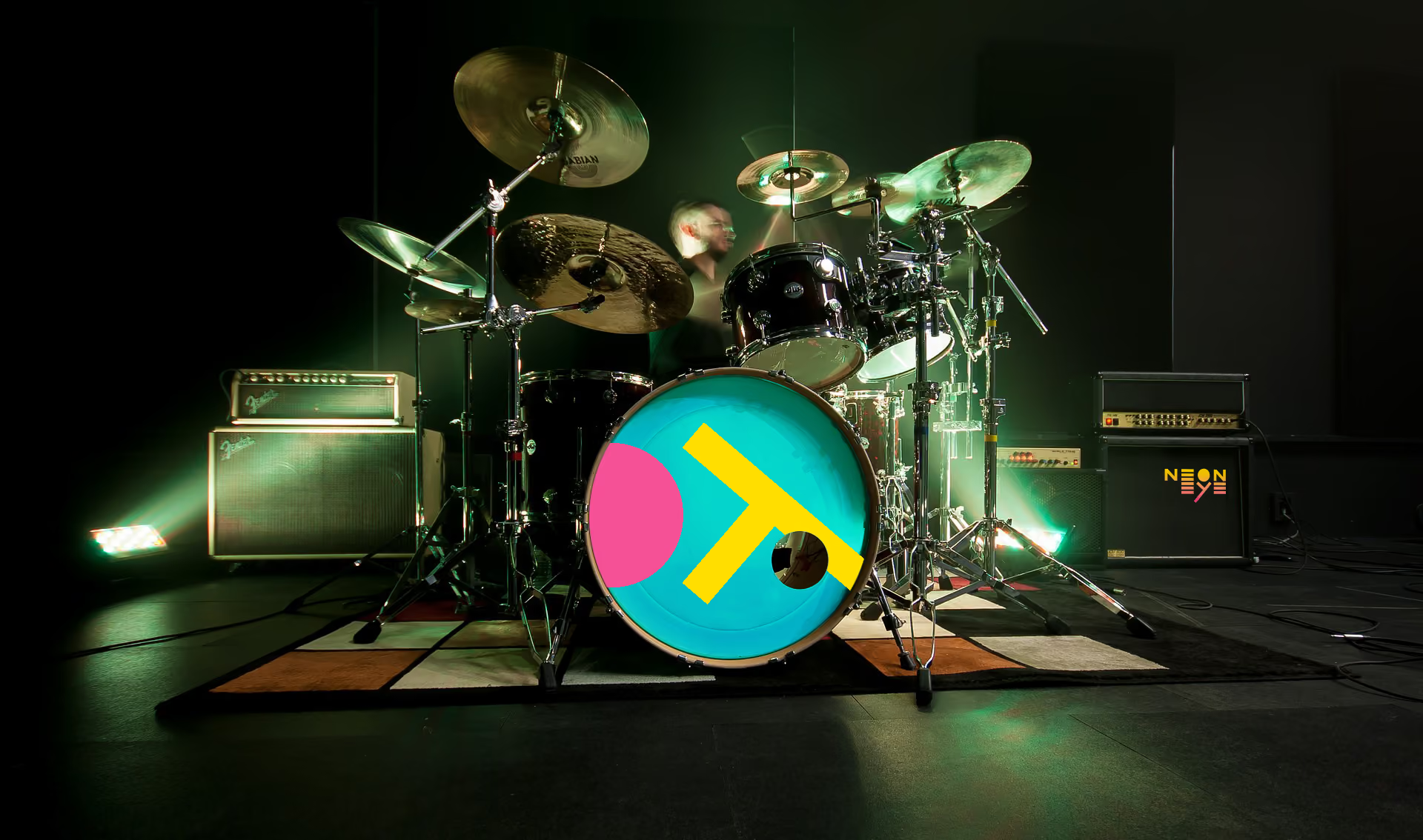
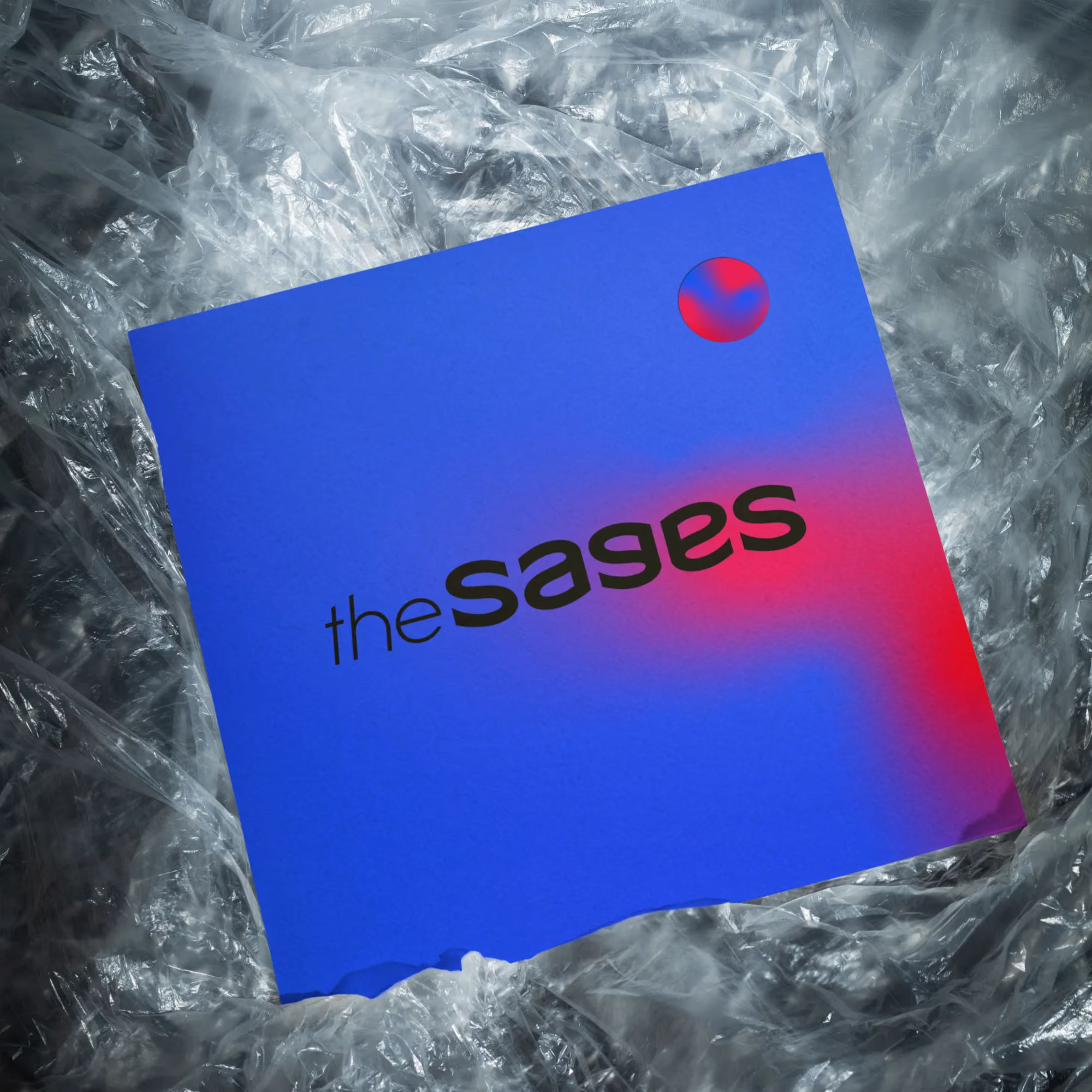

The Sages is an alternative rock band looking for a visual identity to support the release of their debut EP. The goal was to create something bold and recognizable while leaving enough room for the identity to evolve with future releases.
The band’s music naturally shifts between heavier instrumentals and more introspective moments. Instead of choosing one direction, I built the identity around that contrast. The idea was to create a system that feels expressive without becoming visually overwhelming.

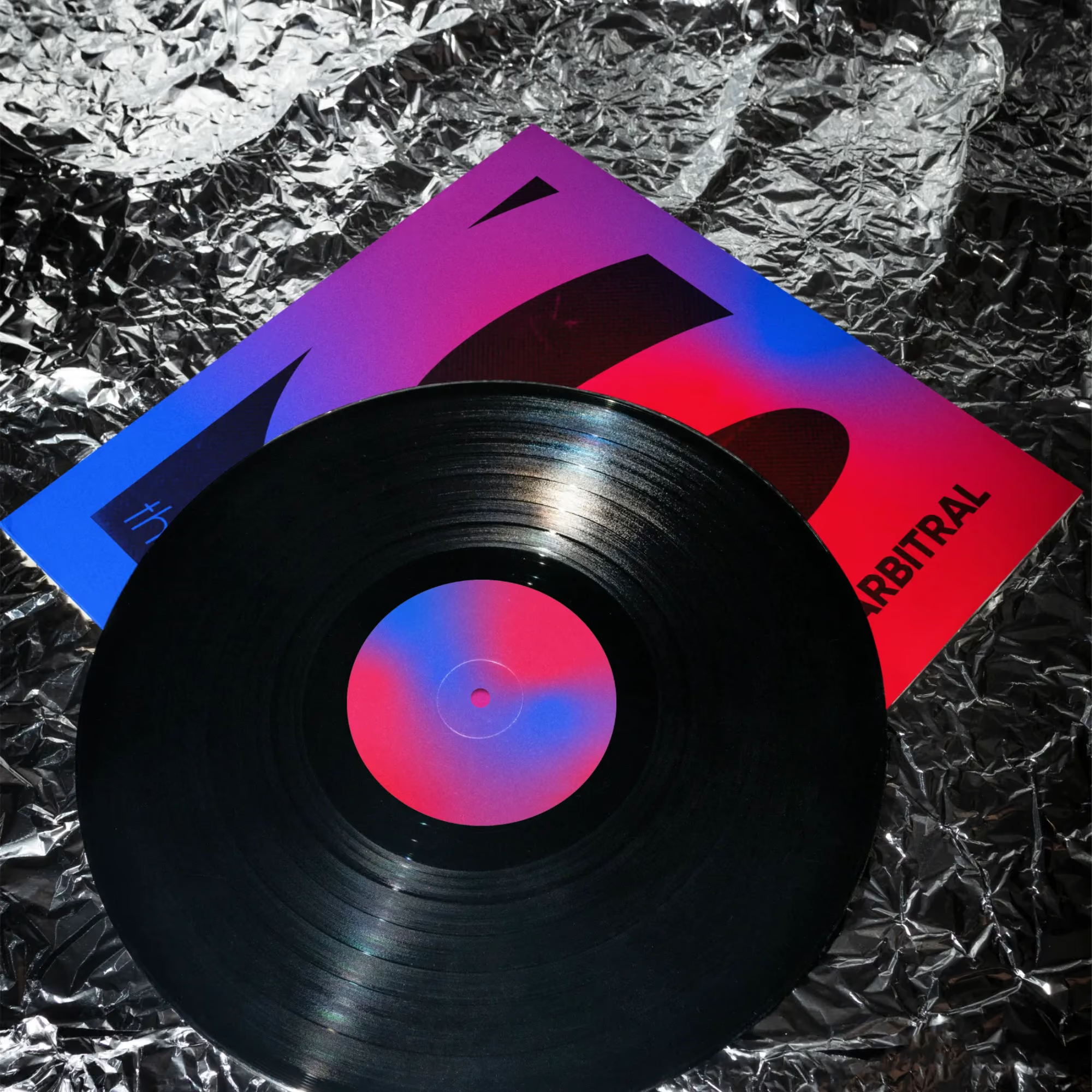
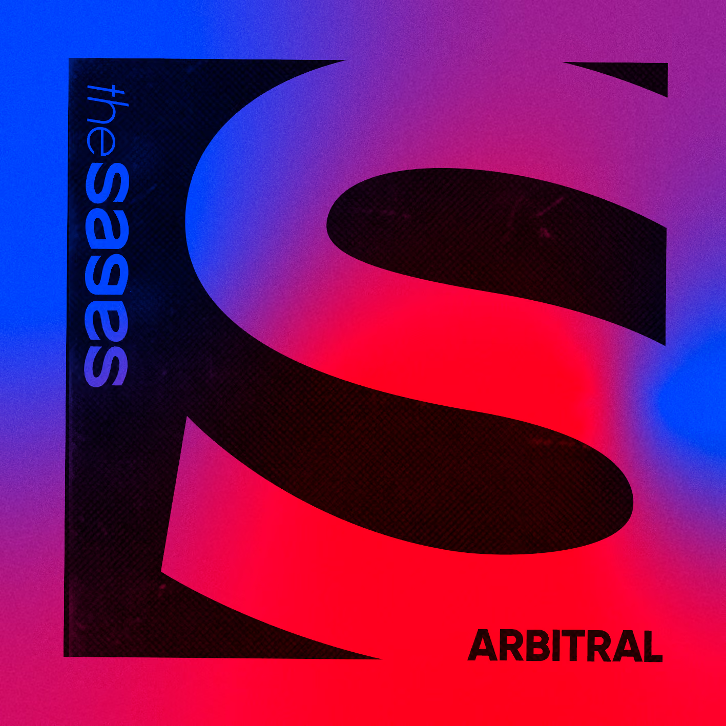
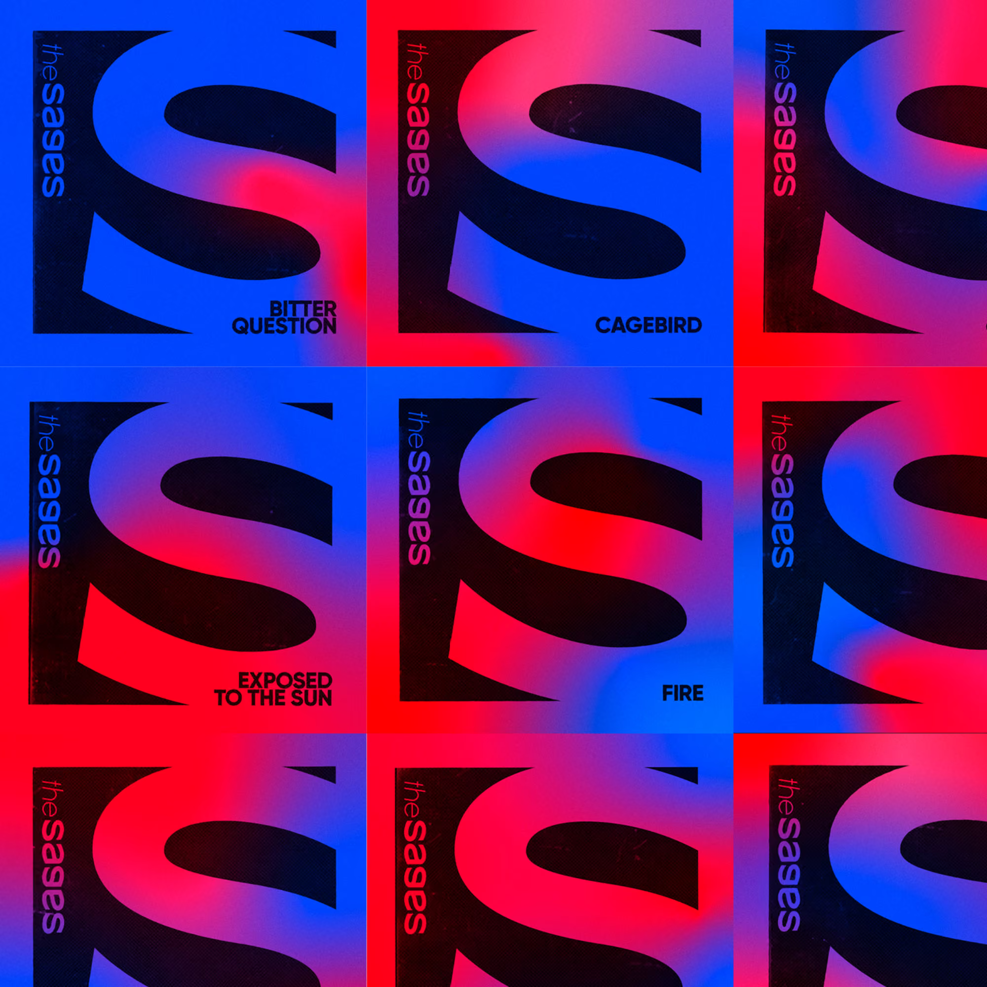
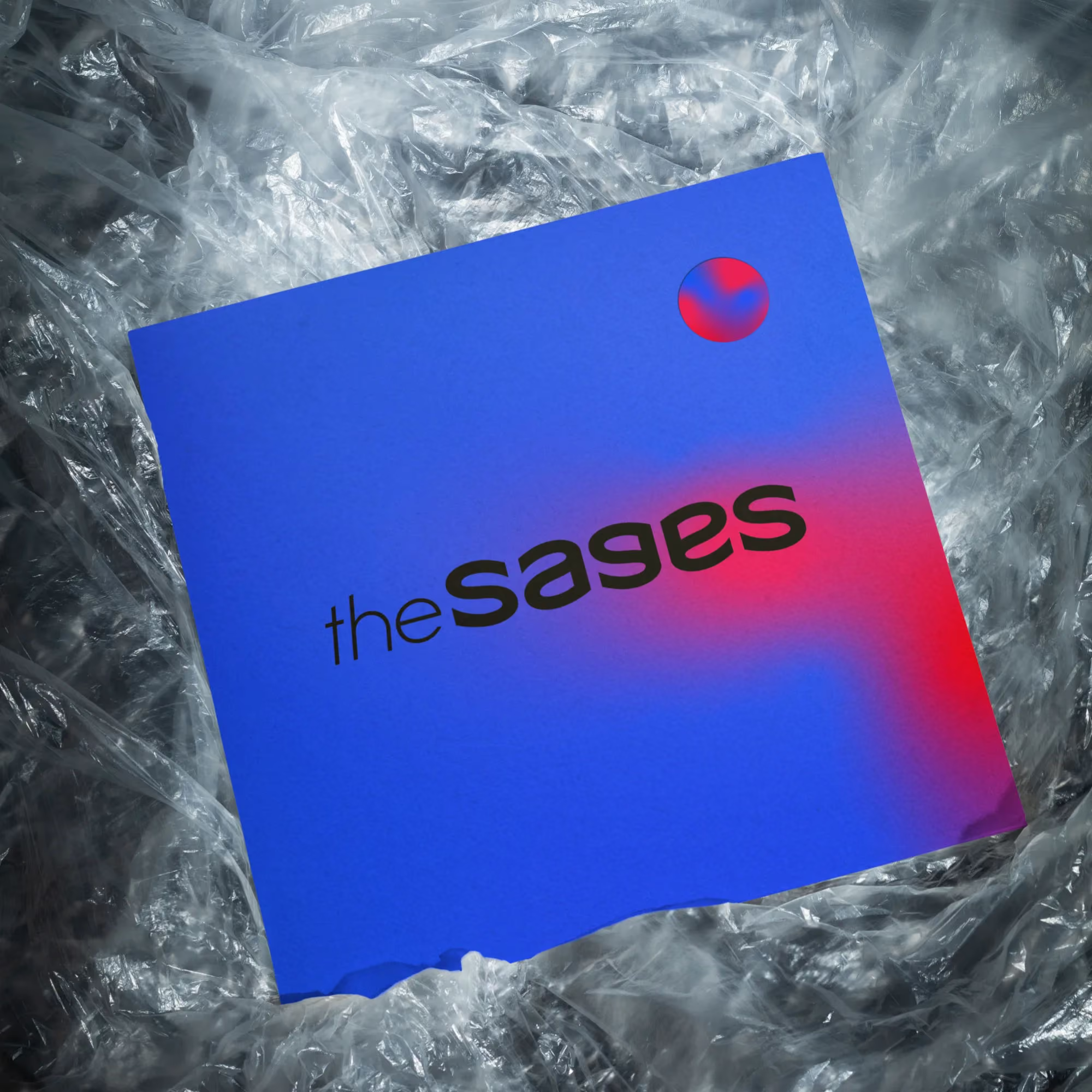


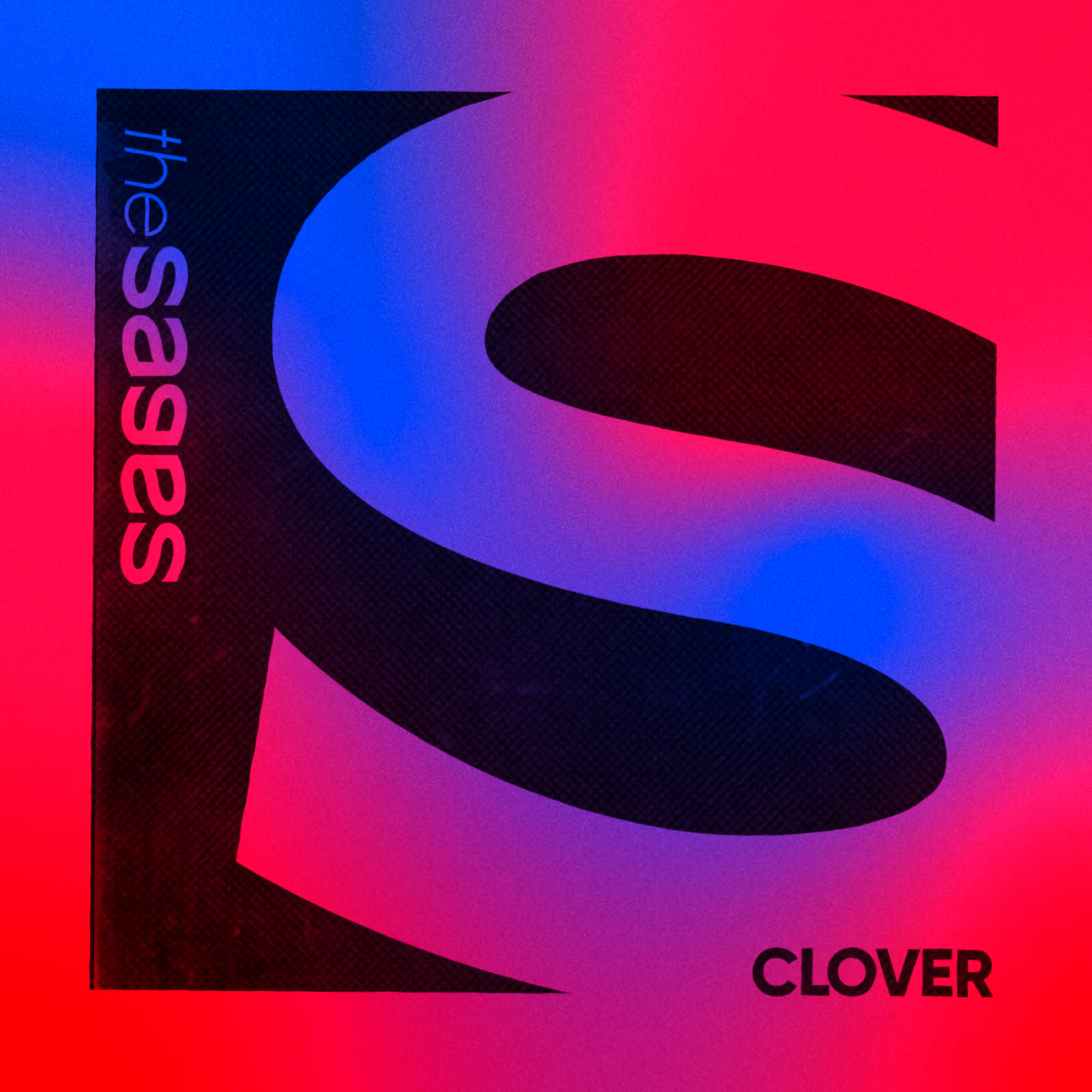
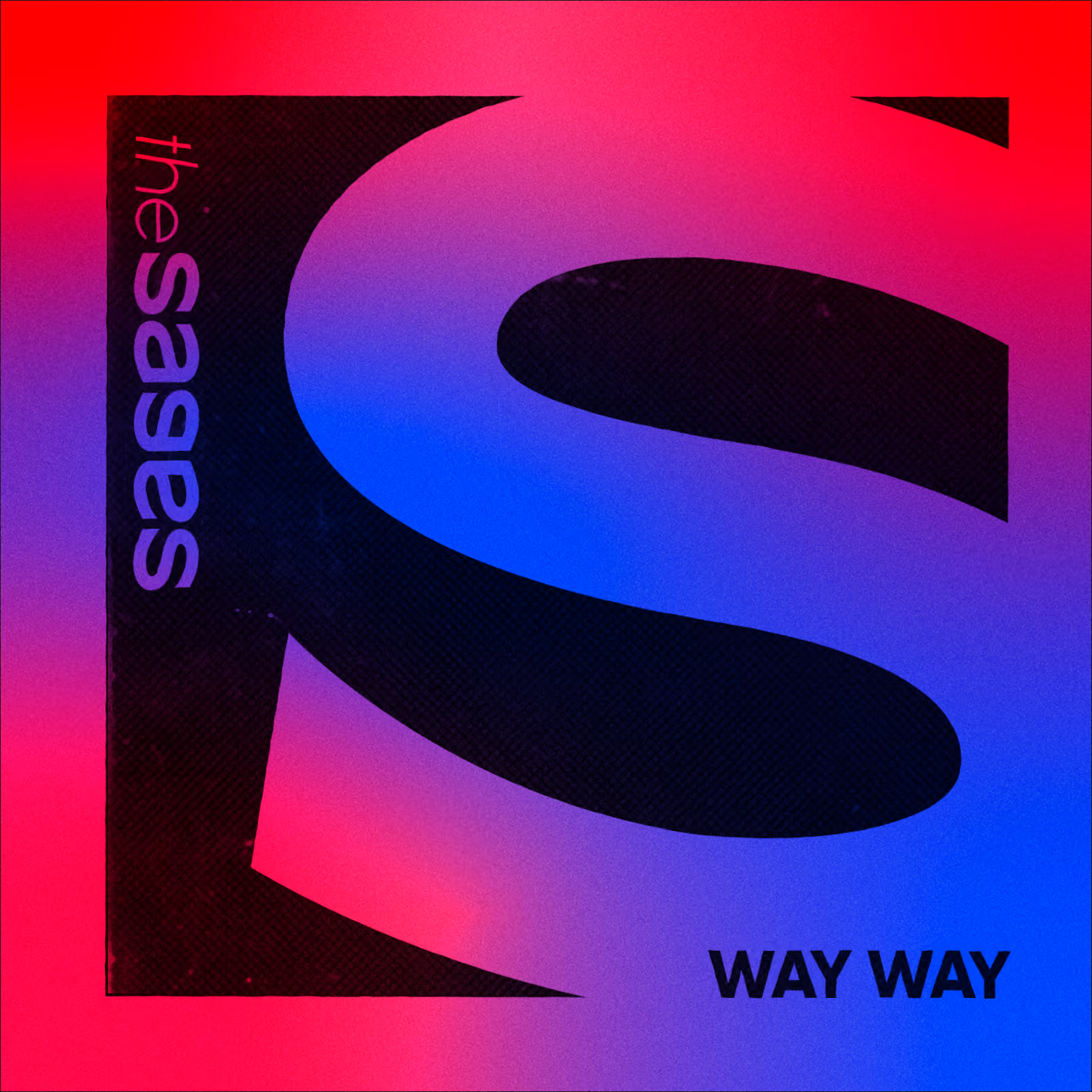
The logo came from a simple experiment with the letter “S”. By rotating and mirroring it, I ended up with a shape that became the foundation for the whole wordmark. The color palette follows the same thinking. Deep blue and vivid red sit on opposite sides, while soft gradients connect them somewhere in the middle, much like the band’s music.
That same visual language carries through the EP artwork and the rest of the promotional materials. The system is simple enough to stay recognizable, but flexible enough to evolve without feeling repetitive.



.avif)